
It is easy to represent the ‘income-expenditure model’ in a graph. Some people find this helpful as a visual aid to understanding; others, not so much. For those who find graphs confusing, this post can safely be ignored. In terms of economic meaning, it does not add much to what has already been explained. But for those who are comfortable with graphs, they can be a handy tool for illustrating or thinking through the logic of a model.
We have seen that, by accounting identity, actual output (Y) always equals actual aggregate expenditure (AE):
Y = AE (1)
As discussed in part 17, this identity holds because actual investment is defined to include unanticipated changes in inventories (unsold output). Whenever inventories are at unexpected levels, firms are assumed to respond by adjusting the level of output.
This assumed behavioral response means that actual output tends toward a level (Y*) equal to planned aggregate expenditure (AEP), which in a closed economy comprises (planned) private consumption, private investment and government spending:
Y* = AEP = CP + IP + GP (2)
Put another way, the model depicts ‘aggregate supply’ (defined as actual output, Y) as adjusting to a level (Y*) that is determined by ‘aggregate demand’ (defined as AEP). It is assumed that the economy is below full employment and within capacity constraints so that it is possible for supply to adjust to demand in this manner.
We have assumed that planned investment and government spending are autonomous of current income, and so take the values I0 and G0, respectively. Planned consumption is described by the consumption function, C = C0 + c(Y – T). In this expression, T represents taxes, which are taken to be a fraction of income (T = tY). Substituting these behavioral assumptions into the expression for planned aggregate expenditure and rearranging gives:
AEP = (C0 + I0 + G0) + c(1 – t)Y (3)
Expressions (1) to (3) give us enough information to graph the income-determination process. In our graph, income and output (Y) will be measured on the horizontal axis. Aggregate expenditure (AE) will be measured on the vertical axis.
When graphed, the first identity, Y = AE, is a straight 45-degree line that starts from the origin (the 0,0 point). This line shows all the points for which actual output equals actual aggregate expenditure.
The AEP schedule, provided by expression (3), is also a straight line. The first set of bracketed terms gives the vertical intercept. This is equal to the sum of the autonomous expenditures (C0 + I0 + G0). Changes in autonomous spending alter the vertical intercept and cause shifts of the schedule. The slope of the AEP schedule is equal to c(1 – t). Changes in the marginal propensities to consume or tax cause the demand-function to steepen or flatten. Lastly, variations in income (Y) cause movements along the schedule. This is because part of planned aggregate expenditure – namely, induced private consumption – rises and falls with income.
The point of intersection between the 45-degree line (Y = AE) and the AEP schedule shows the level of actual output to which the economy tends (Y = Y*). We can solve for this level of output by setting actual income equal to planned aggregate expenditure (part 18 explains how to do this). The result is:

In order to graph the model, it may help to apply some numbers. We can use the same numerical example as in the previous post. There we defined an initial situation with marginal propensities to consume, tax and save of 0.8, 0.25 and 0.2, respectively. These marginal propensities imply an expenditure multiplier of 2.5, calculated as 1/(1 – c + ct). We let government spending, private investment and autonomous private consumption be 25, 10 and 5, respectively. Making use of these numbers, the initial situation can be summarized as:
Y = AE
AEP = 40 + 0.6Y
Y* = 100
These are the three key aspects of our graph: two straight lines and a point of intersection.
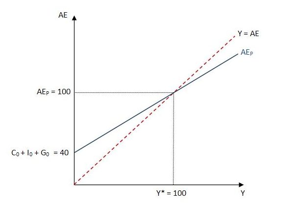
Over the range of output for which the AEP schedule is above and to the left of the 45-degree line, planned aggregate expenditure exceeds actual output. The excess demand causes an unexpected depletion of inventories. By assumption, firms respond by expanding production in an attempt to adjust actual output (supply) to demand. The expansion of output (and actual aggregate expenditure) causes a movement up along the 45-degree line. At the same time, the higher income induces additional private consumption, and hence additional planned aggregate expenditure, represented by a movement up along the AEP schedule.
So, in a situation of excess demand, both actual output (supply) and planned aggregate expenditure (demand) increase. However, because the 45-degree line, with slope of 1, is steeper than the AEP schedule, actual output (supply) can eventually “catch up” to planned aggregate expenditure (demand). A requirement that c(1 – t) is always between zero and one ensures that the AEP schedule has a slope that is always less than 1, and so flatter than the 45-degree line, enabling actual output to adjust to demand. In our particular numerical example, the tendency is for planned aggregate expenditure and actual output to converge at Y* = 100.
Conversely, at any output for which the AEP schedule is below and to the right of the 45-degree line, planned aggregate expenditure is less than actual output. Due to excess supply, unsold inventories mount more than expected and firms respond by cutting back production in an effort to adjust output to demand. There is a movement down along the 45-degree line as output contracts, and the lower income causes a reduction in induced private consumption, depicted as a movement down along the AEP schedule. Again, granted this behavioral response by firms, actual output will tend toward Y* = 100.
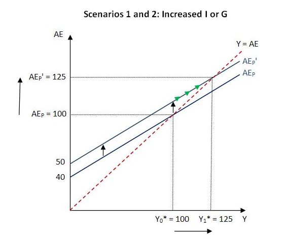
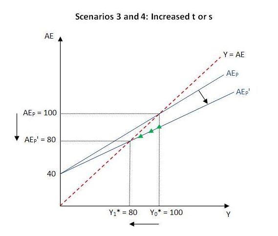
In the previous post, we considered various scenarios in isolation, starting each time from the initial situation already described. We can now consider these scenarios in terms of our graph. The scenarios are:
- a doubling of private investment from 10 to 20;
- an increase in government spending from 25 to 35;
- an increase in the marginal propensity to tax from 0.25 to 0.375;
- an increase in the marginal propensity to save from 0.2 to 0.333.
Within our simple model, scenarios 1 and 2 have an identical effect on planned aggregate expenditure. In either scenario, the vertical intercept (C0 + I0 + G0) increases by 10. This causes an upward shift of the AEP schedule. The excess demand causes firms’ inventories to deplete and they endeavor to replenish them by expanding production. The extra income that results induces additional private consumption and causes a movement up along the AEP schedule, indicated by the small green arrows. The new AEP schedule intersects the 45-degree line at output of 125. The increase of 25 in the value of Y* equals the multiplier (2.5) times the change in autonomous spending (10). This can then be added to the initial value of Y* to arrive at the new value. Alternatively, Y* can be calculated directly by substituting the various values for the parameters and exogenous variables into equation (4).
Scenarios 3 and 4 both cause the AEP schedule to flatten and intersect the 45-degree line at output of 80. Before the change, the slope of the AEP schedule was 0.6. This can be calculated as c(1 – t) = 0.8(1 – 0.25) = 0.6. In both scenario 3 and 4, the slope becomes 0.5. In scenario 3, this is calculated as 0.8(1 – 0.375) = 0.5 and in scenario 4 it is calculated as 0.66(1 – 0.25) = 0.5. The expenditure multiplier also changes from 2.5 to 2.
The four scenarios are illustrated in the diagrams below:
Further reading
More detail on the graphical treatment of the income-expenditure model is provided in an earlier post:
